Dow Vision 2030
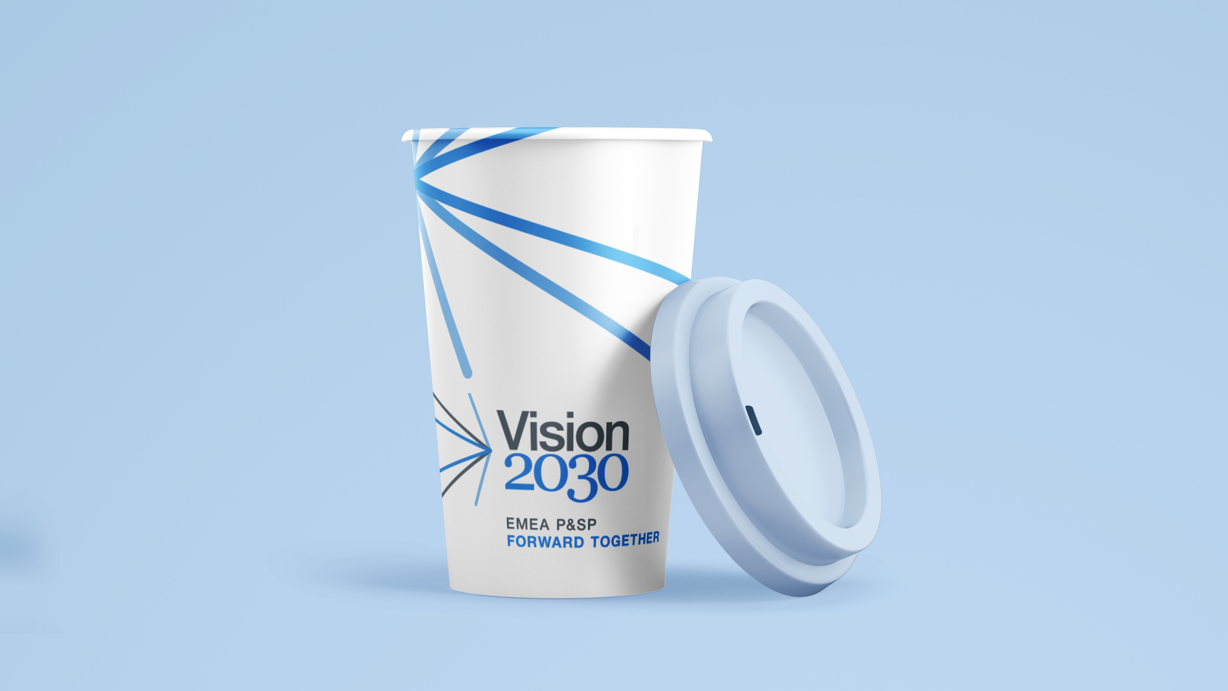
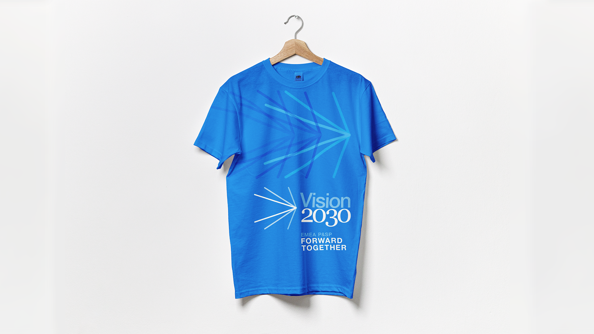
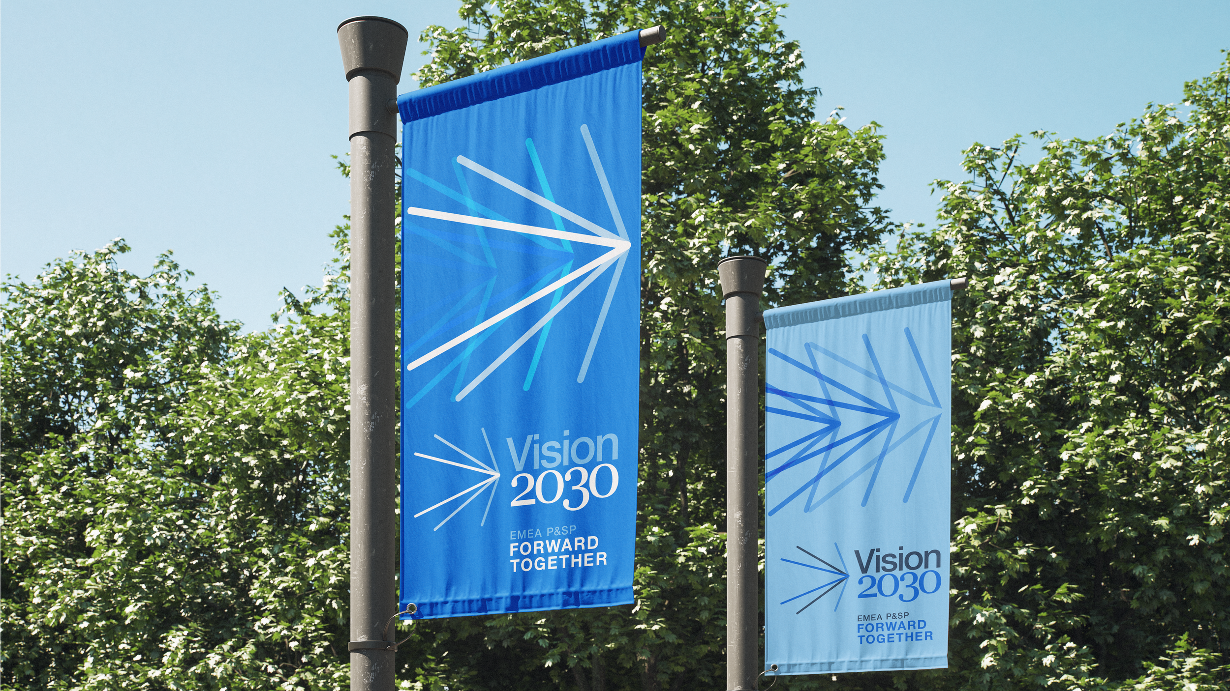
We developed the visual identity for Dow Chemical’s Vision 2030 initiative, creating a system designed to work across a wide range of channels and applications, from outdoor and PowerPoint presentations to social, print, and future placements that hadn’t yet been defined.
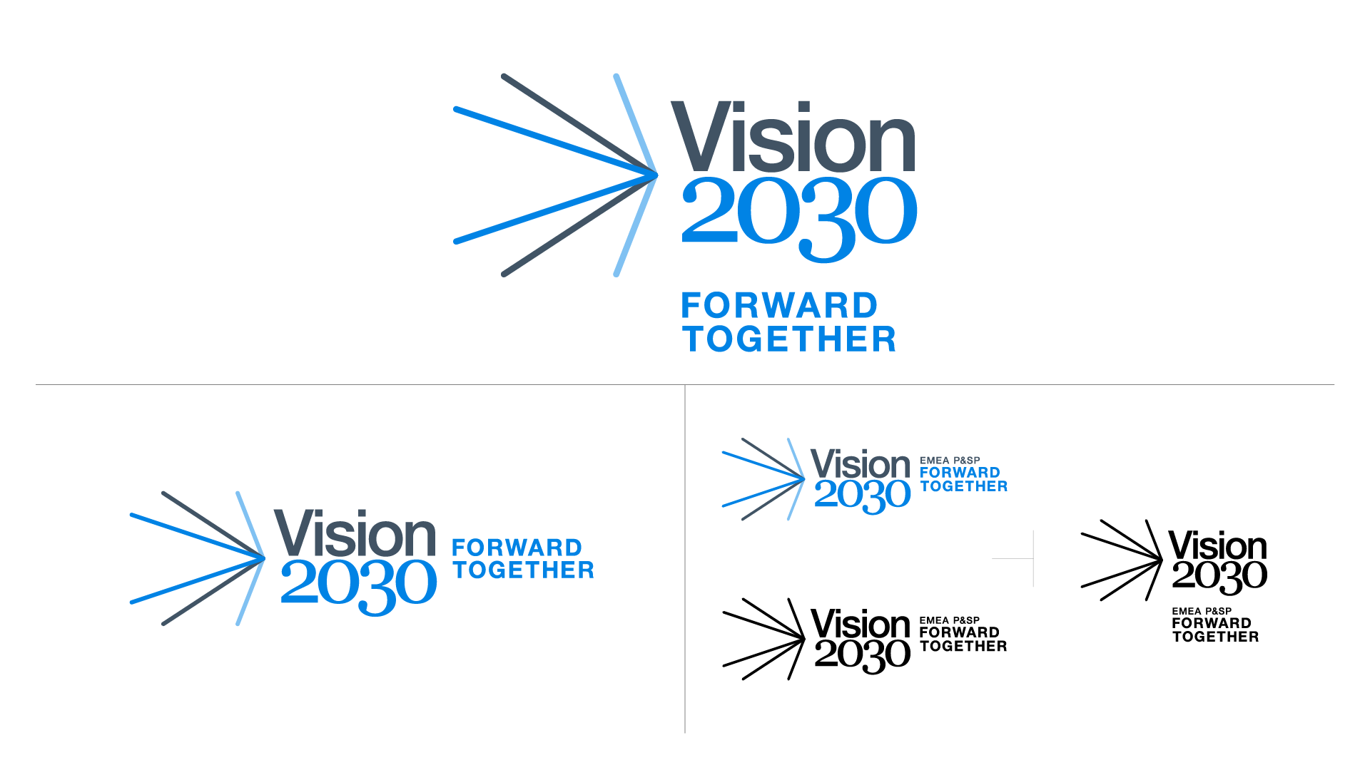
Because the full scope of the initiative’s future applications was impossible to predict, versatility was central to the design. The identity needed to live within Dow’s existing brand guidelines while introducing a sense of freshness, energy, and a forward-looking perspective.
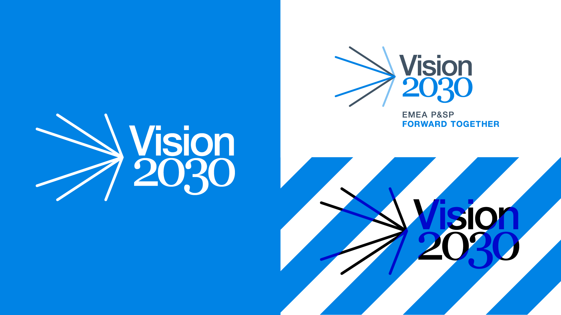
The focal angles became a visual metaphor for the many points of view across the company coming together. Used as a graphic element or expanded into patterns and applications, they created a sense of movement, dimensionality, and vibrance.
Color played an important role in giving the identity its own presence. We introduced a vibrant blue that sits opposite Dow’s signature red, matching its saturation and brightness so it remained compatible with the existing palette while feeling distinctly new. Blue was also a color Dow used far less frequently, giving the Vision 2030 identity a natural point of distinction.
The result was a flexible visual system built to evolve with the initiative and support its global presence for years to come.